Note
Go to the end to download the full example code.
Fill area between curves
Using the fill_between parameter of the pygmt.Figure.plot method it is
possible to fill the area between two curves y1 and y2. Different fills (colors or
patterns) can be used for the areas y1 > y2 and y1 < y2. Optionally, the curves can
be drawn.
To plot an anomaly along a track use pygmt.Figure.grdlandmask and see the
gallery example Wiggle along tracks.
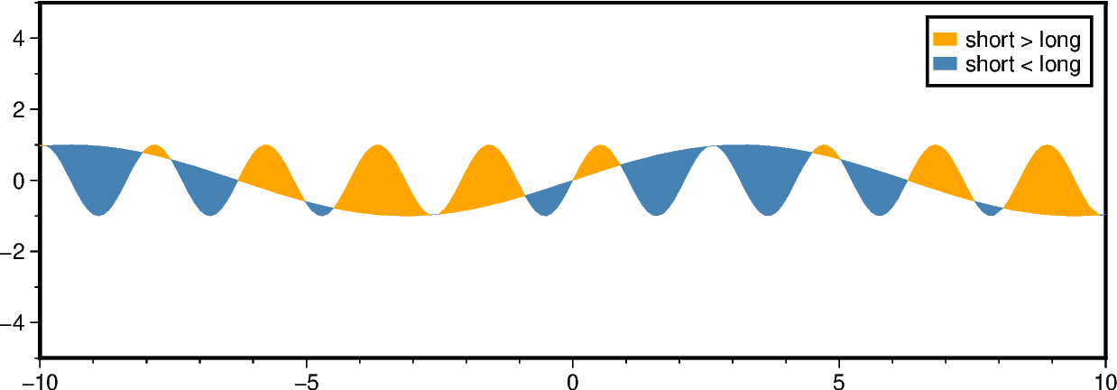
Fill the areas between the two curves using the fill_between parameter.
Use the fill parameter and the modifier +g for fill_between to
set different fills for areas with y1 > y2 and y2 < y1, respectively. Use
the label parameter and the modifier +l for fill_between to
set the corresponding legend entries.
fig = gmt.Figure()
fig.basemap(region=[-10, 10, -5, 5], projection="X15c/5c", frame=True)

fig.plot(
    data=data_df,
    fill="orange",
    label="short > long",
    fill_between="c+gsteelblue+lshort < long",
)

fig.legend()

fig.show()
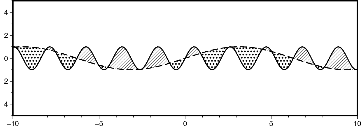
Additionally to filling the areas, we can draw the curves. Use the pen
parameter and the modifier +p for fill_between to set different
lines for the two curves y1 and y2, respectively.
fig = gmt.Figure()
fig.basemap(region=[-10, 10, -5, 5], projection="X15c/5c", frame=True)

fig.plot(
    data=data_df,
    fill="p8",
    pen="1p,black,solid",
    fill_between="c+gp17+p1p,black,dashed",
)

fig.show()
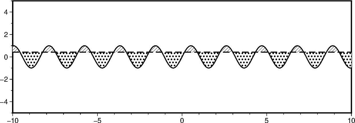
To compare a curve y1 to a horizontal line, append +y to fill_between
and give the desired y-level.
fig = gmt.Figure()
fig.basemap(region=[-10, 10, -5, 5], projection="X15c/5c", frame=True)

fig.plot(
    data=data_df[["x", "y1"]],
    fill="p8",
    pen="1p,black,solid",
    # Define a horizontal line at y=0.42
    fill_between="c+gp17+p1p,black,dashed+y0.42",
)

fig.show()
Total running time of the script: (0 minutes 0.344 seconds)